2024
Product Design
Graphic design
Design: Egor Gerasimov, Anna Kalinicheva

Jan Marini Skin Research, a San Jose, CA-based company founded in 1994. JMSR is a recognized leader and innovator in skin care that is committed to continually expanding and improving the professional skin care market. JMSR's two primary focuses are to provide innovative technologies that deliver proven, measurable results and an unwavering commitment to the ongoing success of our customers.
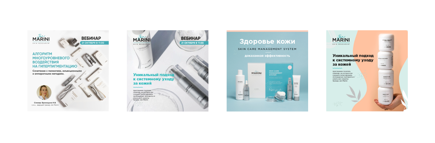
Jan Marini Skin Research, a leader in professional skincare, aimed to expand into new international markets. The primary challenge was to create a comprehensive and visually appealing catalogue that effectively showcased the brand’s full product line. Additionally, the brand needed localized promotional materials such as presentation decks, website banners, and social media assets that could engage new audiences while maintaining brand consistency.
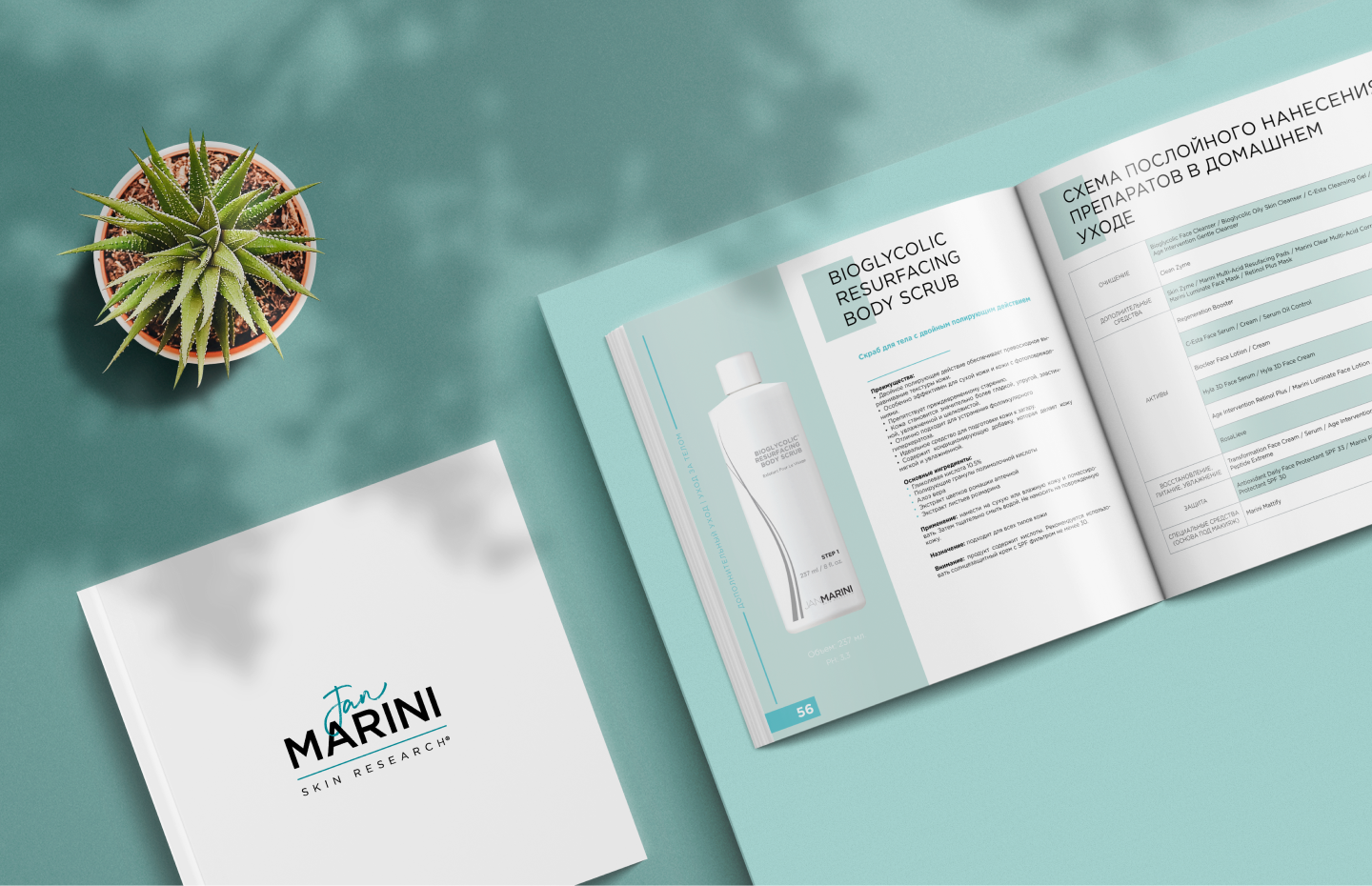
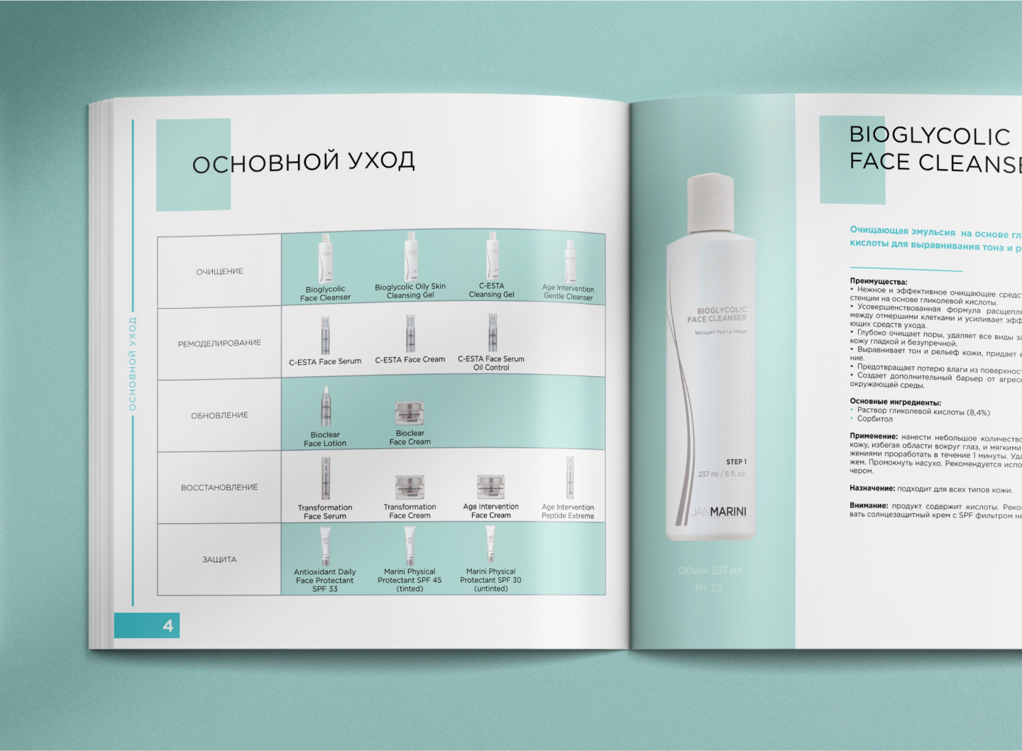
Our team collaborated closely with the client’s product department to gather and organize technical content, clinical findings, and imagery. We transformed this complex data into a clean and modern catalogue with easy-to-read product descriptions and branded infographics. To support market entry, we also created a suite of promotional materials including tailored social media content, Instagram stories, and digital banners. All designs were optimized for engagement and aligned with the brand’s visual identity.
Graphic design
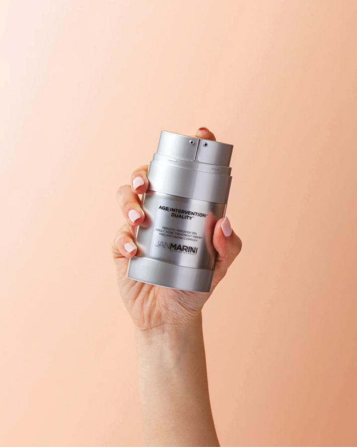
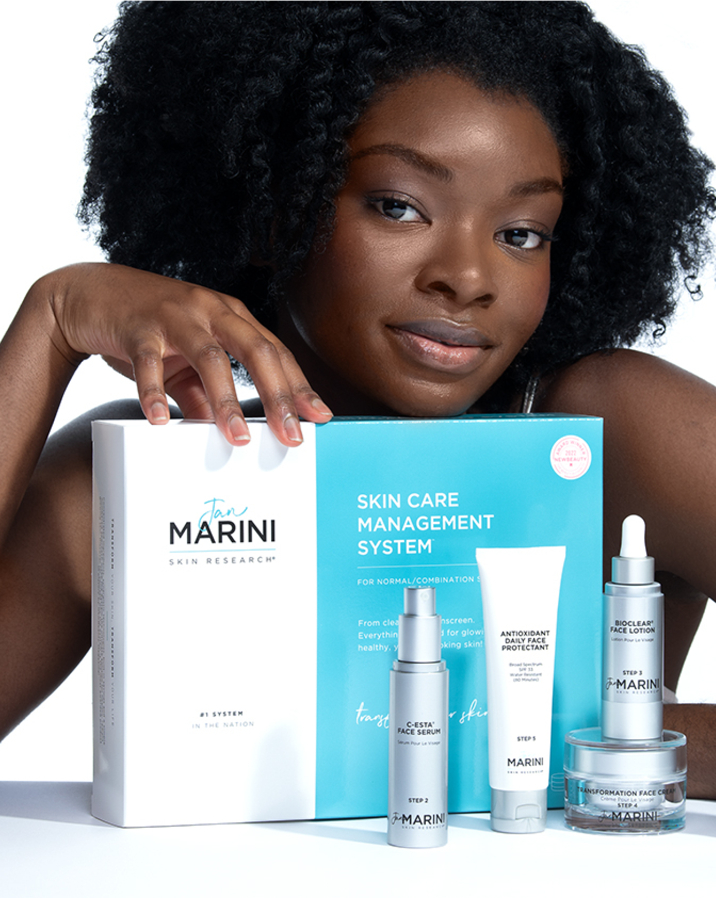
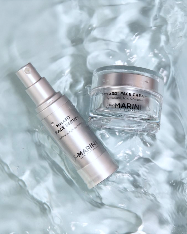
We worked closely with the client's product department to gather and organize all product information, including detailed descriptions, images and technical specifications. We then created a visually stunning catalogue/magazine that highlighted the unique features and benefits of each product.
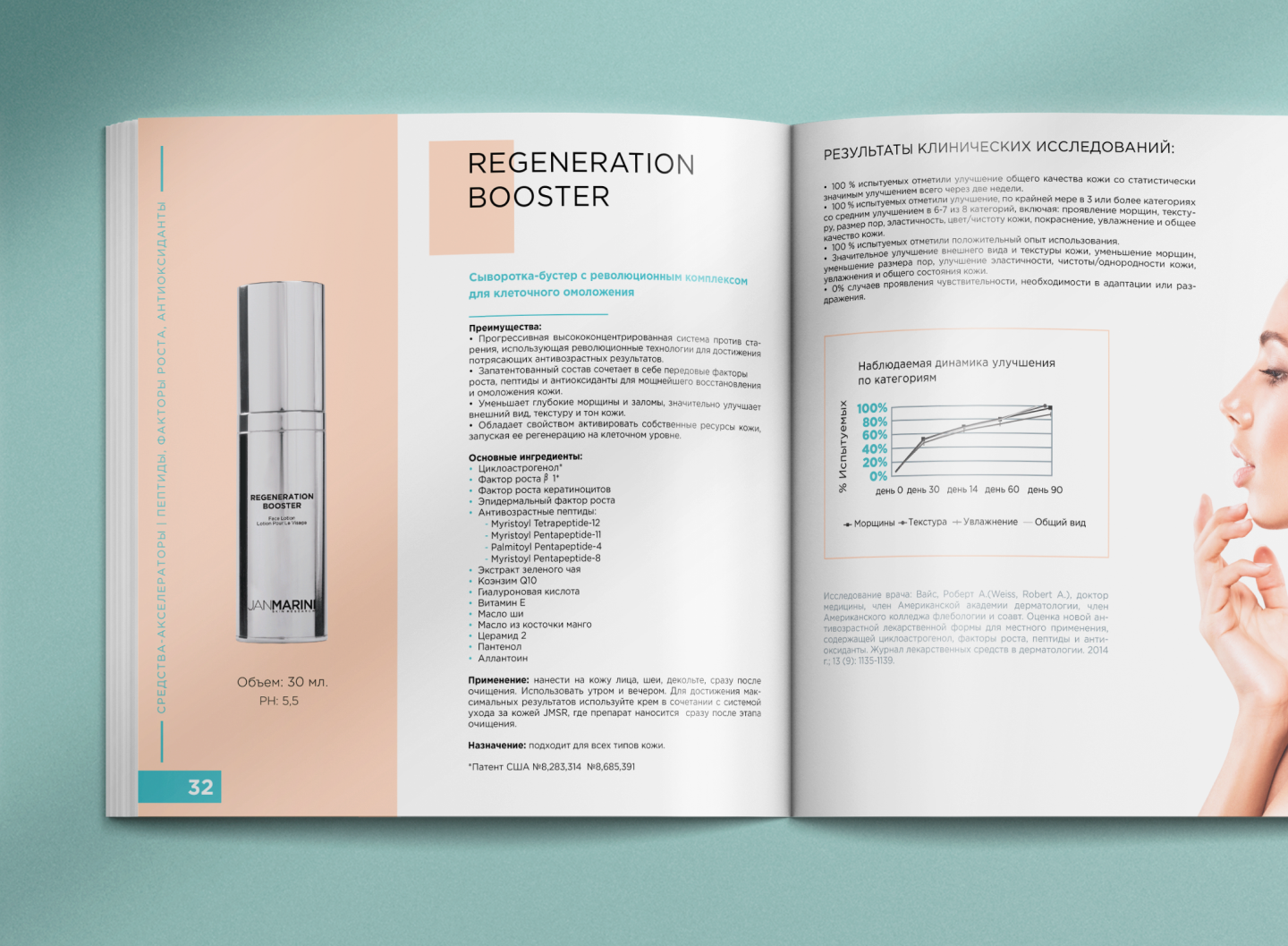
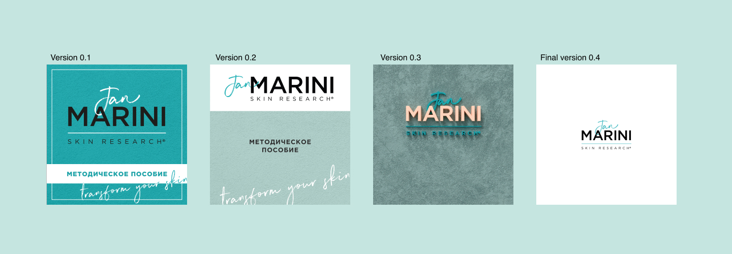
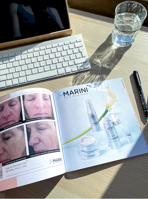
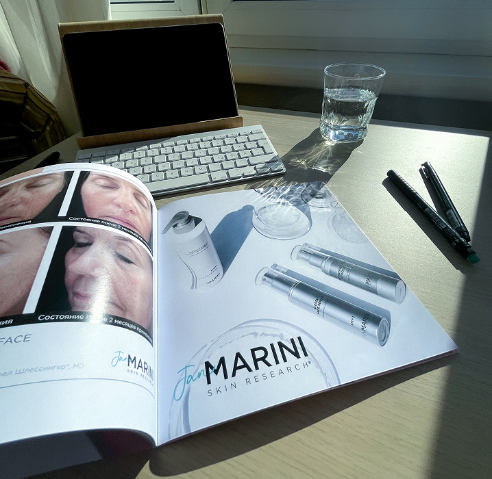
One of the challenges was to review the technical manual with clinical studies and incorporate the key findings into the product catalogue. This all had to be framed in a clear and understandable infographic. But our team used a clean and modern design aesthetic to showcase the products, highlighting high-quality images and simple, easy-to-read descriptions. We also used branded colors and typography to maintain consistency throughout the materials.
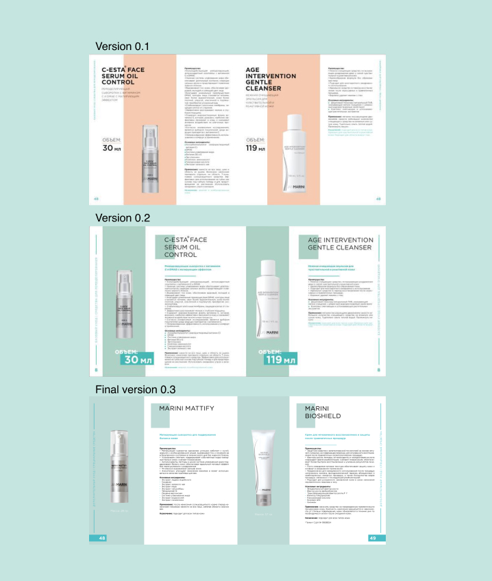
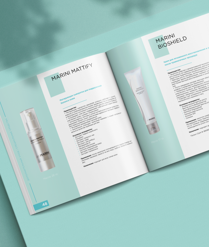
We ensured that technical details such as ingredients, instructions, and certifications were presented in a legible and organized manner, harmonizing with the overall design. The use of icons and layout grids helped maintain the balance between regulatory requirements and visual appeal.


Overall, our team's expertise in design ensured that the promotional materials were both visually compelling and strategically effective. The catalogue, in particular, was well-received by customers and served as a useful tool for the client's sales team in pitches and presentations. As a result of our work, the brand saw a significant increase in website traffic and social media engagement.
The brand's products were also better understood by customers, leading to increased sales and revenue. We're proud to have contributed to the brand's success and look forward to continuing to help them grow and thrive in the local market.


