2020
Flavour Labs KFT
Graphic design
Motion design
UX/UI Design
Project Management
Kurwa-snus.com
Art Direction: Anna Chernokozova
Design: Anna Kalinicheva, Egor Gerasimov, Igor Vyatkin
Web Design: Egor Gerasimov
3D Art: Rod Romantsov, Anna Chernokozova
Project management: Egor Gerasimov

Flavour Labs KFT - is a company producing the latest and the safest nicotine replacement without electronics, smoke and burning. They create nicpacks based on high-quality nicotine and cellulose. Products don’t contain actual tobacco, resins, systemic poisons, carcinogens and mutagenic substances. Products by Kurwa are fully legal for sale in the EU and have all the relevant certificates.
Our challenge was to develop several new lines of Kurwa snus and tobacco flavors and design for them, while also creating a website, promo materials, and campaign to showcase them. We wanted to build on Kurwa's existing success and create a new wave of excitement for the brand.
To do this, we worked closely with Flavour Labs KFT to understand their product and their vision for the future. We researched the latest trends in snus and tobacco industry and packaging design to create unique, eye-catching designs that would stand out on shelves and online.
Graphic design, Motion design, UX/UI Design, Project Management
We approached the design process with careful attention to every detail. Our first step was to research the target audience and understand their preferences and needs. Based on our findings, we developed several design concepts that would effectively communicate the brand's message and appeal to the target market.

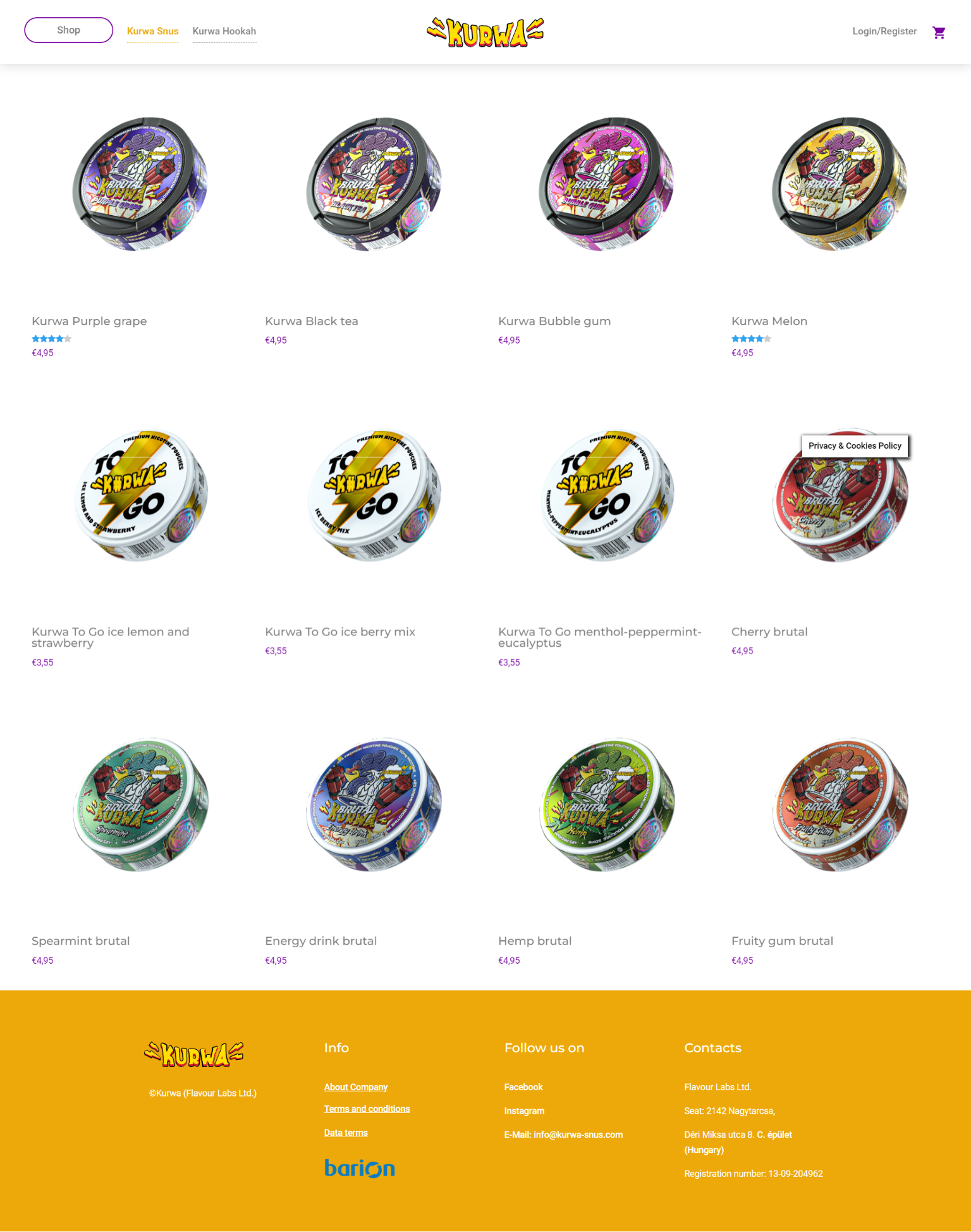
The K#rwa brand label is based on a scheme of proportions. Despite the variety of flavours and collections of the K#rwa brand, we have maintained the integrity and consistency of the visual component of the labels. There are specific rules for each line collection, which are clearly spelled out in the brand manual. We have also developed a technical label that contains all the necessary legal information about the product.

Subsequently, we switched to a multilayer label format with important product safety information. This was the final and most universal format for this type of product. This way, we needed to avoid creating different labels and constantly moving the blocks of information for each country where the product was delivered. The design of the technical information on the underside of the packaging complies with all European regulations and standards.
We made sure to pay attention to every detail on the label, considering its technical aspects such as the ingredients, instructions, warnings and contact information. We divided it into several sections, using the universal and readable Circle font family taking into account the label's small size (53 x 53 mm).


.png)


Our campaign showcased the new K#rwa flavors and design through social media, influencer partnerships, and targeted ads. The result was a huge success, with K#rwa gaining new customers and building brand loyalty among existing ones. Our team collaborated closely with the creative director to develop a series of innovative video posts for each flavor, showcasing the unique taste profiles and capturing the attention of potential customers. In addition to the videos, we also developed a collection of witty and humorous quote-based posts that resonated with our target audience. As a result, K#rwa saw an uptick in sales and an overall boost in brand recognition.


When creating the website for K#rwa, our goal was to make it as user-friendly as possible. We wanted customers to easily find the information they needed about the benefits of K#rwa, and to be able to purchase their favorite flavors with just a few clicks. To achieve this, we designed a website that was both visually appealing and easy to navigate.
We started by developing two color variations for the website, one with a light background and one with a dark background. Both versions were designed to be easy on the eyes and to complement the colorful K#rwa packaging. However, after careful consideration, the client decided to go with the dark version of the website, which they felt was more in line with the brand's edgy and modern image.


.jpg)
When the client first came to us with a request of redesign the labels and develop a new series of labels for new line of flavors we felt like this project could turn into something interesting and fun to work with so we took this challenge and this is the outcome of collective work. We have developed 3 new snus product lines, a line of tobacco, a website, social media materials and campaign around it. And of course some other necessary POSm materials.
In the end, our challenge was not just to create innovative flavors and design, but to help K#rwa become the game-changer of the snus and hookah society.

.jpg)
