2024
Product Design, Packaging
Graphic design
Design: Egor Gerasimov

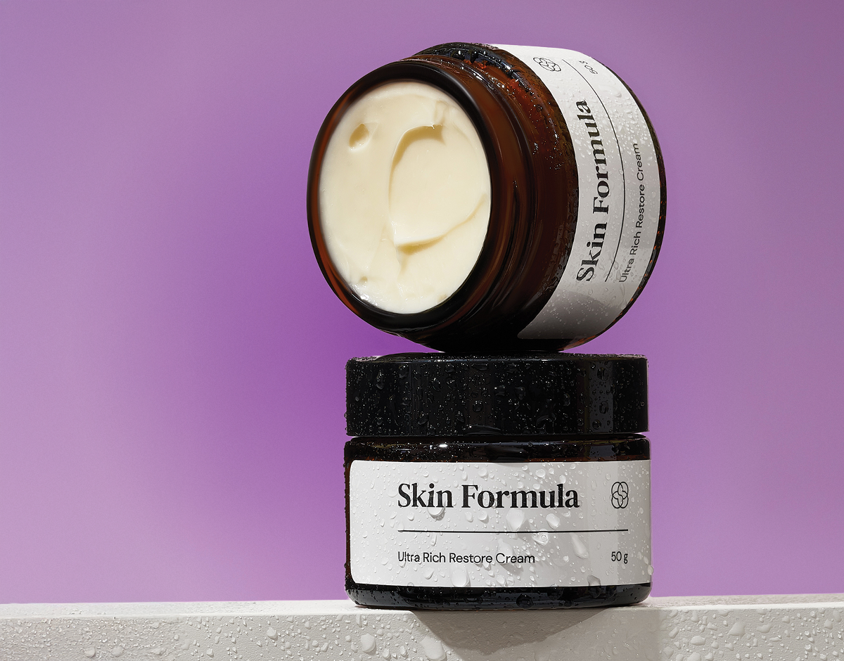
Skin Formula is a South Korean professional cosmetics brand known for its commitment to eco-friendly production and cutting-edge scientific developments in skincare. Their products are developed in their own research center, merging the essence of ancient Korean traditions, natural ingredients, and the latest fermentation technologies.
The client needed packaging that would not only reflect the high quality and innovative nature of their products but also communicate their commitment to sustainability and natural ingredients. Additionally, the client wanted to ensure that technical and regulatory information was clearly presented without compromising the visual aesthetics of the brand.
We were tasked with creating a cohesive series of 12 product labels and packaging designs that would align with the brand’s identity - merging science, tradition, and nature. The design had to incorporate modern aesthetics.Moreover, the packaging had to feature technical information such as product ingredients, usage instructions, and certifications, all while maintaining clarity and visual appeal. Alongside the packaging, we were also responsible for designing a comprehensive product catalog that would provide customers with an in-depth look at each product’s formulation and benefits.
Graphic design

Each label was carefully designed to balance aesthetics with functionality. The labels feature clean, minimalist typography and a color palette inspired by nature, reflecting the brand’s eco-conscious values.

We ensured that technical details such as ingredients, instructions, and certifications were presented in a legible and organized manner, harmonizing with the overall design. The use of icons and layout grids helped maintain the balance between regulatory requirements and visual appeal.


Since most of the products come with an additional packaging box, we collectively decided to include the ingredients exclusively on the box, leaving only essential information on the product label itself.


We successfully developed a series of 12 distinct yet cohesive packaging designs, each reflecting the brand’s core values of science and nature. Additionally, we designed a 20-page magazine/catalog that offered a detailed description of each product, highlighting the innovative fermentation processes and natural ingredients used in their formulation. The packaging and catalog not only enhanced the brand’s market presence but also reinforced its credibility and commitment to eco-friendly, science-driven skincare solutions.


